Personalising Interfaces Through Constraint-Driven Design
August 2026
Overview
This work proposes a mechanism that takes in personal information about someone’s cognitive characteristics and generates an interface fitted to them, drawing on the basic principles of interface design, on safety and accessibility requirements, and on research findings about human characteristics.
It applies an idea I call constraint-driven design: a human designs the conditions that must hold and the range over which they apply, and inside that frame generative AI works out the concrete proposal. Taking a car navigation system as the subject, I implemented a proof of concept that generates interfaces from thirteen fictional personas — sensory and physical characteristics included — and checks the fit to those conditions in a separate step.
In the comparison, one case showed a clear change in screen composition driven by a physical characteristic, while most of the generated output showed no large visual change. Actual usability and safety remain untested, but the work made clear how far judgement can be handed to generative AI, and which design conditions were narrowing the room for individualisation.
Background — how far can one interface reach?
Most products design and ship a single shared interface, meant to work for as many people as possible. But people differ in how much information they can take in at once, in how easily they direct attention, in how readily they follow wording, and in how precisely they can operate small targets. An interface that considers many people is not necessarily one that fits any given person.
Assessment at the level of a group has its limits too. In the voluntary guidelines NHTSA published in 2013, for instance, each acceptance criterion on eye glances asks that at least 21 of 24 participants meet it. That is not a condition meaning everyone can use the thing in the same way. [1]
Even in products where text size or the amount shown can be changed, the user has to notice that the setting exists, connect it to the difficulty they are having, and choose the right adjustment. Are those settings going underused, leaving people with an interface that does not fit them? That question was the starting point.
In a car navigation system, looking at the screen and operating it compete with the attention driving demands. [1] If a poor fit with the interface can add to that load, then preparing a state that suits the person at the point they start using it is worth examining, for usability and for safety alike.
Generative AI has made it possible to prototype a step that works an interface out from personal information and design knowledge. That opened a way to deliver an interface fitted to a person while reducing the burden of designing every screen by hand, one person at a time.
How much these settings are actually used, and how a poor fit with the interface bears on accidents, were not examined in this project.
Proposal — connecting personal information to two kinds of design knowledge
The input is information about that user’s cognitive characteristics. The AI matches it against two bodies of knowledge prepared in advance: one holding the basic design rules of an interface, the other linking human characteristics to the interfaces they call for.
Working from these, the AI settles the interface within what is permitted, and the fit to the conditions is checked. The output is an interface fitted to that person, together with an account of what was changed and why.
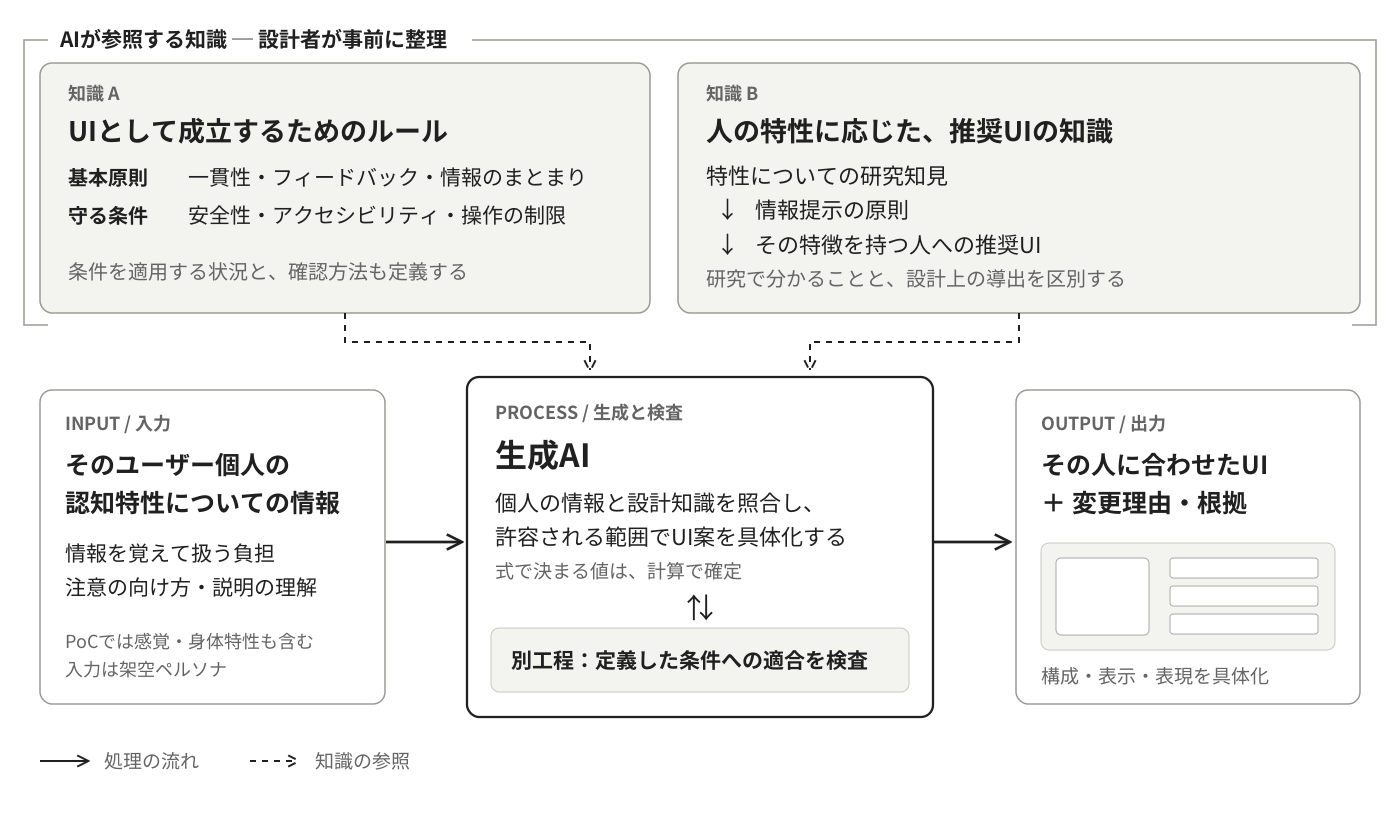
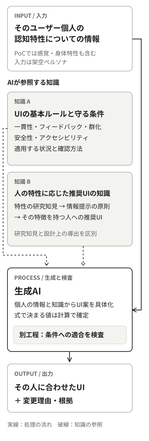
Input: information about the person
For example, how well someone holds and works with information at once, how readily other stimuli pull their attention away, and what kind of explanation they follow most easily. The implementation also covered vision and manual dexterity. The screen is not decided from a diagnostic label; what is handled is personal information that bears on using an interface.
Knowledge A: the rules an interface has to satisfy
The basic principles of interface design are set out: consistency, feedback on actions, the grouping of information, and the legibility of text and of touch targets. On top of these, the operating restrictions on in-vehicle interfaces and the accessibility requirements are defined together with the situations in which they apply.
Knowledge B: from characteristics to the interface they call for
Human characteristics established in research are tied to principles for presenting information, and from there to interface design. For a characteristic such as “holding information while operating is a burden”, the direction becomes “reduce what has to be remembered”, which leads to designs that keep the necessary information on screen.
Research on a characteristic does not, however, hand over a design value for a car navigation system. What the research establishes is kept distinct from the design judgements this project drew from it. Improvements that help everyone alike belong to the basic rules and are not counted as a result of individualisation.
The intended experience — working out the fit together, on the first drive
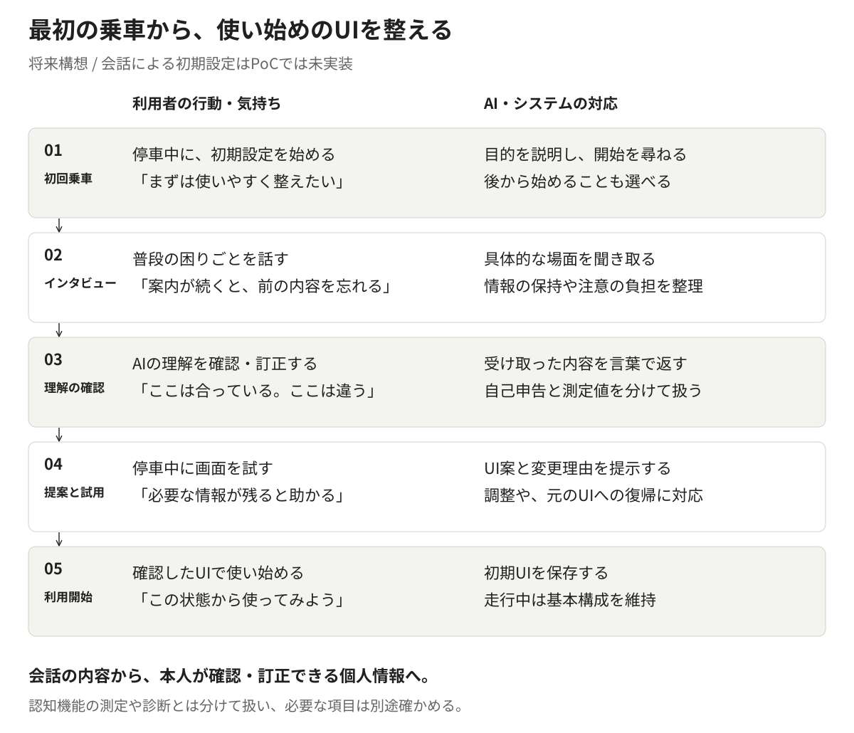
A future concept. Setting up through conversation is not implemented in this proof of concept.
You buy a car and sit in the driver’s seat for the first time. With the car stationary, an AI agent asks about how you use things. Instead of picking through technical settings, you talk about what usually gives you trouble and what you find easy to use.
-
First drive: starting the conversation
AI“To fit the screen to you, could you tell me a few things about how you usually use it? We can also do this later.”
The user understands the purpose and chooses whether to begin now or later.
-
Interview: talking about the difficulties
AI“When directions come one after another, where does it get hard to follow?”
User“When the next instruction arrives, I sometimes forget what the last one said.”
The AI asks about concrete situations and sorts out the difficulties that bear on holding information and on directing attention.
-
Checking understanding: the user can correct what the AI took in
AI“So it would suit you better if the information you need stayed on screen, rather than having to remember the steps — have I understood that right?”
The user confirms or corrects that reading. What someone reports in conversation is kept separate from measured cognitive scores and from diagnoses; where an item calls for measurement, a separate way of establishing it is provided.
-
Proposal and trial: hearing the reason, trying the screen
AI“To reduce what you have to keep in mind, I’m proposing a screen where the current action and the next step are both visible.”
With the car stationary, the user tries things such as choosing a destination. They can say “the old one was clearer” or “I’d word this differently”, and the proposal can be adjusted, or the original interface restored.
-
Starting out: using the interface they confirmed
The interface the user confirmed is saved as the initial state. While the car is moving, the basic structure the user has learned stays put. When they want to revisit it, they can adjust again while stationary.
The point of the conversation is not to classify the user once and for all. It is to prepare the state they start from, through an exchange in which they can explain themselves and correct what was heard.
Implementation — separating the conditions that hold from the judgements left to AI
What was implemented is the mechanism that takes in a person’s characteristics, generates an interface, and then checks, renders and compares it. In place of the conversational interview, thirteen fictional personas with differing characteristics were defined as the input.
Car navigation was chosen as the subject because it lets conditions be handled concretely: screen area, the size of touch targets, how much can be shown, and what may be operated while driving.
Constraint-driven design as a way of working
Constraint-driven design, as this project uses the term, is a method in which a human designs the conditions that must hold and the range over which they apply, and the AI proposes concrete solutions inside that frame.
A rule-based parametric change settles in advance which value or option each input maps to. This concept, instead of filling in every mapping, fixes the permitted range and the grounds for each judgement, and leaves the unsettled values and wording to the discretion of generative AI. The implementation combines the parts decided by calculation with the parts decided by generative AI.
| What the evidence establishes | How the implementation treats it |
|---|---|
| A value or a relation is settled | Computed, within the conditions and the range that could be confirmed |
| The direction of adjustment is known, but not the degree | Settled within the direction and the constraints, and recorded as an untested design judgement |
| The evidence alone does not settle a sound choice | Treated as an exploratory proposal and marked as awaiting evaluation |
Wherever a research finding was carried into the interface, the source, the conditions of application and the design judgement were recorded. Emitting the reasons alongside the interface makes it possible to trace why this person ended up with this screen.
Checking the generated interface in a separate step
The interface is generated as structured data holding its elements and layout, and rendered from that data. Numerical and structural conditions are checked in code; a few conditions that call for interpreting meaning are checked separately by an LLM. Items outside automatic judgement, and those that could not be checked for want of material, are recorded as well.
What the check confirms is the fit to the conditions as defined. Whether the interface is actually easier to use, or safer, calls for evaluation by users.
When a contradiction between conditions is found at the design stage, the AI points to where it is and a person decides how to revise the conditions. It is not a mechanism in which the AI rewrites the conditions to suit itself at every generation.
Comparing interfaces — one that changed a great deal, one that barely did
The baseline for comparison is the interface built from shared defaults, with no personal characteristics as input. Against the same feature set, the output produced when personal characteristics were supplied was compared with it.
The images below are output from the prototype, not a commercial navigation system before and after a redesign. The personas do not reproduce real users either; they are fictional input for establishing what a characteristic does to the interface.
A case where the touch targets grew
PS-12 — a persona with a physical characteristic that makes fine touch operation difficult
Age and cognitive and sensory characteristics match the PS-01 baseline; only manual dexterity differs. In the images shown, each touch target has grown and the items down the middle of the screen fall from seven to four. The fixed buttons along the bottom are not counted in that number.
Shared default interface
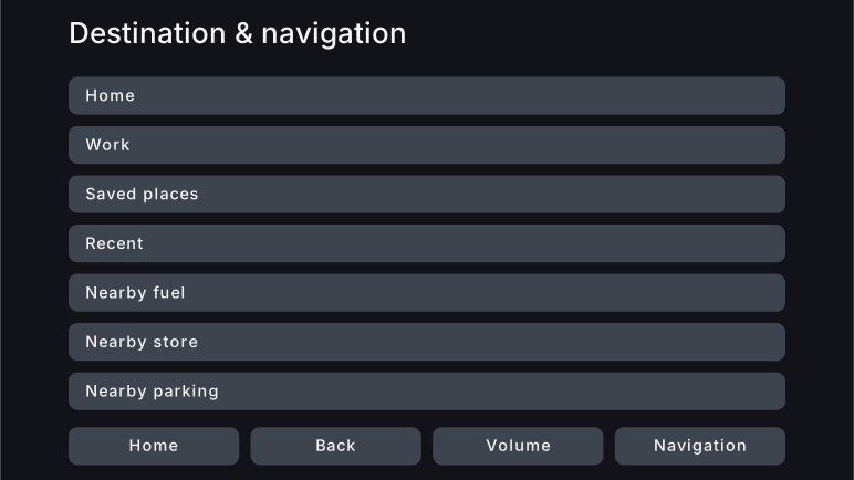
Interface generated from personal characteristics
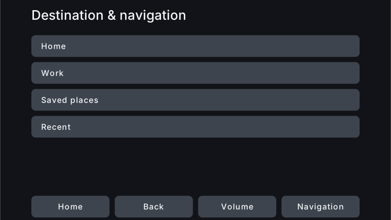
Making the touch targets larger costs something: fewer items can be chosen at once on the same screen. The feature set is designed to be preserved, but this one screen alone cannot settle how easy it is to move on to the screens that follow.
A case where the composition barely changed
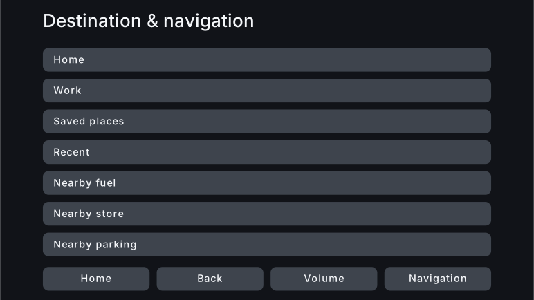
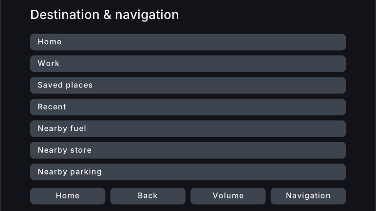
PS-01 — the persona set as the baseline
Text size differs slightly, but the number of items, the layout and the size of the touch areas are much the same. With this combination of rules and input, nothing came out that changed the composition greatly from the shared default interface.
Shared default interface
Interface generated from personal characteristics
Results and discussion — where the freedom to generate remained
The value only generative AI could add was not adequately shown
In my own visual comparison, PS-12 was the one I could recognise as a clear change in screen composition. Other outputs differed in wording and in settings, but not enough for a large difference in value to be recognisable from how the screen looked.
The change in PS-12 was also within reach of settings that adjust display size and the amount shown. There is something in the experience of arriving at a fitting initial state without hunting for the settings yourself. Whether that experience is valuable, and whether generative AI is needed to produce the interface, are two things that have to be established separately.
This proof of concept did not show that fitting an interface to cognitive characteristics improved task performance, nor that generative AI produced a better interface than a rule-based approach.
The design space built here was narrow
Once text and touch targets are held to the sizes they need, and the conditions on screen area and on how much may be shown are applied, the compositions still available run short. In the implementation, a good deal was also settled by calculation or by fixed structure, leaving the AI little room to choose among several sound proposals.
Wording kept some freedom, but those differences are less visible than a change in composition, and the visual assessment used here could not capture their value. To establish what generative AI is worth, I concluded, the proposals available have to span a range, and those differences have to mean something to the user’s experience.
This result concerns the rules gathered here, the interface parameters adopted, and the range of expression implemented. It is not a limit of car navigation in general, nor of individualised interfaces in general.
Nor did I read the full text of every relevant standard from JIS, ISO and the like. The design knowledge was assembled from the material I could obtain: papers, official guidance, public data, and the text or preview of some standards. The range of what I consulted may well have shaped which design options were available. Whether a close reading of the standards would widen that freedom, or narrow it further with additional conditions, is something still to be established.
Working with AI improved the rules themselves
Where results did appear was in the process of designing the conditions for generation and making them checkable.
| Problem found | How it was carried into the design |
|---|---|
| The same element carried several lower bounds, and how to combine them was unclear | The relations of application were made explicit, so that no bound is ever undercut |
| A condition meant to apply only while driving was applying while stationary too | The driving state in which each condition applies was stated explicitly |
| How plain the wording is and whether an icon is present had been merged into a single axis | They were separated into independent design axes, restoring options that had been eliminated for no reason |
| The AI was drawing on conditions that do not apply to the output at hand | The conditions to consult were stated explicitly for each output |
| Judgements meant to be left to the AI had been fixed on the implementation side | The division of roles between specification and implementation was revised |
The AI points to a problem, a person judges it, and the design takes it up. Through that exchange, what has to hold for everyone, and where an interface can be fitted to the individual, came into focus.
Next — establishing the value of the experience and the value of generative AI
The next step is to examine two questions separately.
One is how much value there is in an experience where the interface you start from is fitted without your having to set it up. That means implementing the conversational interview, the correction of what was understood, and the trial, then establishing how reliable the input is and how much it asks of the user.
The other is what kind of design subject makes the differences between AI-generated proposals amount to a better experience. I want to move to subjects where the necessary conditions still hold and several sound proposals remain open in the structure of information and the flow of interaction.
An evaluation with real users would compare, on the same task, the shared default interface, an interface adjusted from personal information by rules, and one worked out by generative AI. Task time, errors, eye glances and subjective load would separate the effect of fitting the interface to the person from the effect of having used generative AI.
The reading of the relevant standards will also go further, updating the boundary between what research establishes and what is a design judgement. Beyond being able to check the conditions, the next task is to leave options inside them that mean something to the user.
References
- NHTSA, Visual-Manual NHTSA Driver Distraction Guidelines for In-Vehicle Electronic Devices (published 2013). Voluntary guidelines. For the eye-glance acceptance criteria see VI.E; for the account of attention and risk see I.C and elsewhere in the main text. This does not mean that the proof of concept has been certified as meeting that test. The document on the Federal Register