Takafumi Horiuchi

Practice Log n Share

Overview

Log practice with one tap, then show the same screen to your teacher at a lesson. I planned and designed this iPhone app for my own saxophone practice and implemented it in collaboration with AI.
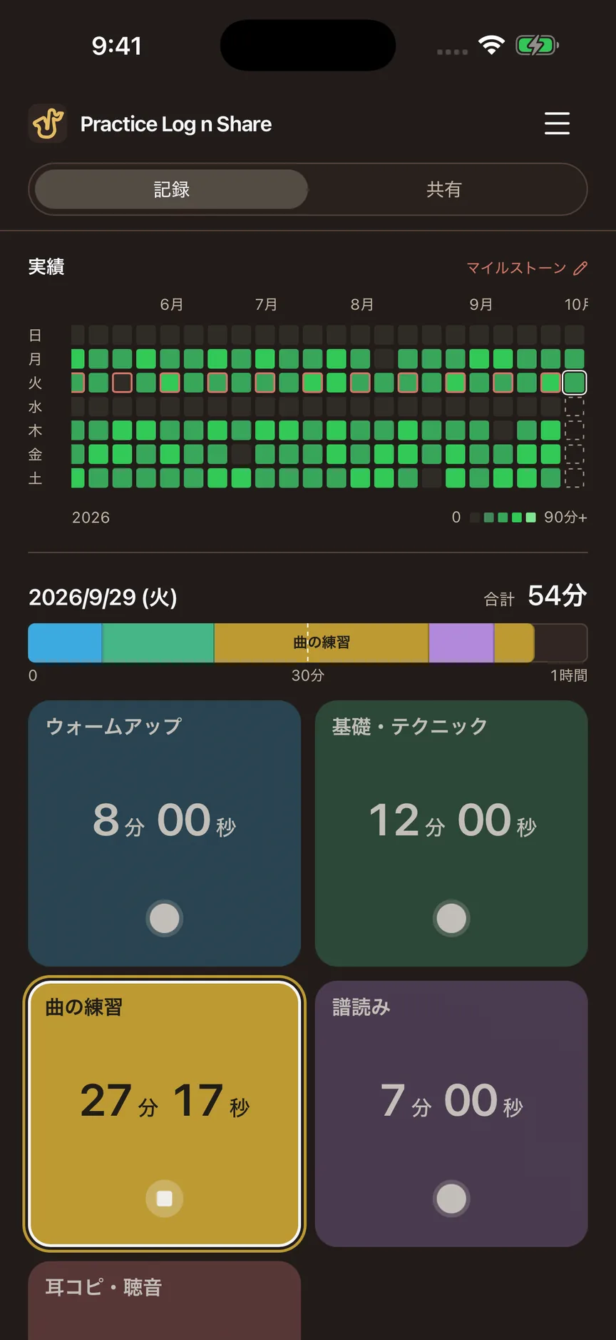
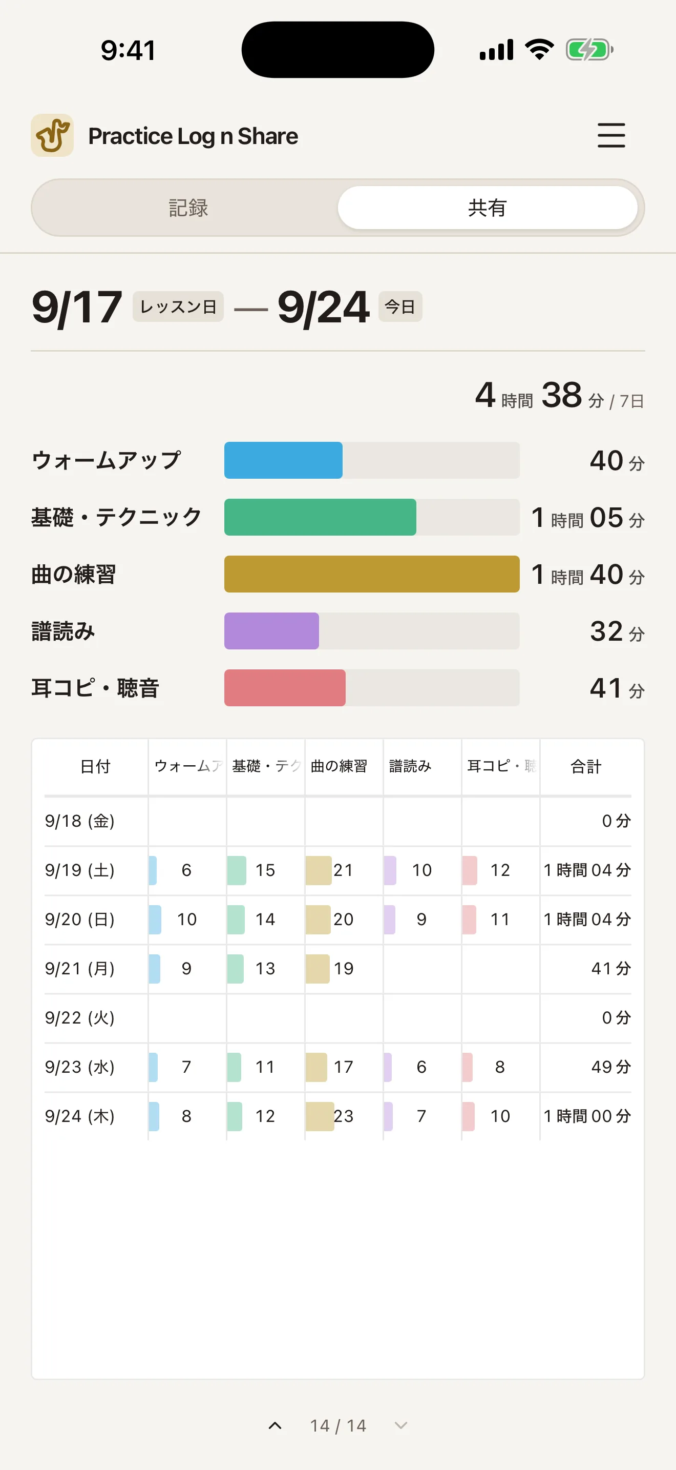
Log screen. A practice history grid sits above today's bar (54 minutes in total) and category cards. “Piece practice” is being timed at over 27 minutes, highlighted with a brighter color and a white outline. Share screen. The period from the lesson on September 17 to September 24 totals 4 hours 38 minutes, shown with bars by category and a daily table displaying every category without horizontal scrolling.
Log on the left, Share on the right. Tap a category to start timing, then show a summary of practice between lessons. The screens use fictional data for illustration. Screenshots show the original Japanese interface.
Role
Planning, UX/UI design, implementation (with Claude Code and Codex)
Period
September 2026
Technology
React · TypeScript; Swift (WKWebView, Live Activity, StoreKit, iCloud)

Background — When asked “How has practice been going?”, I couldn't say

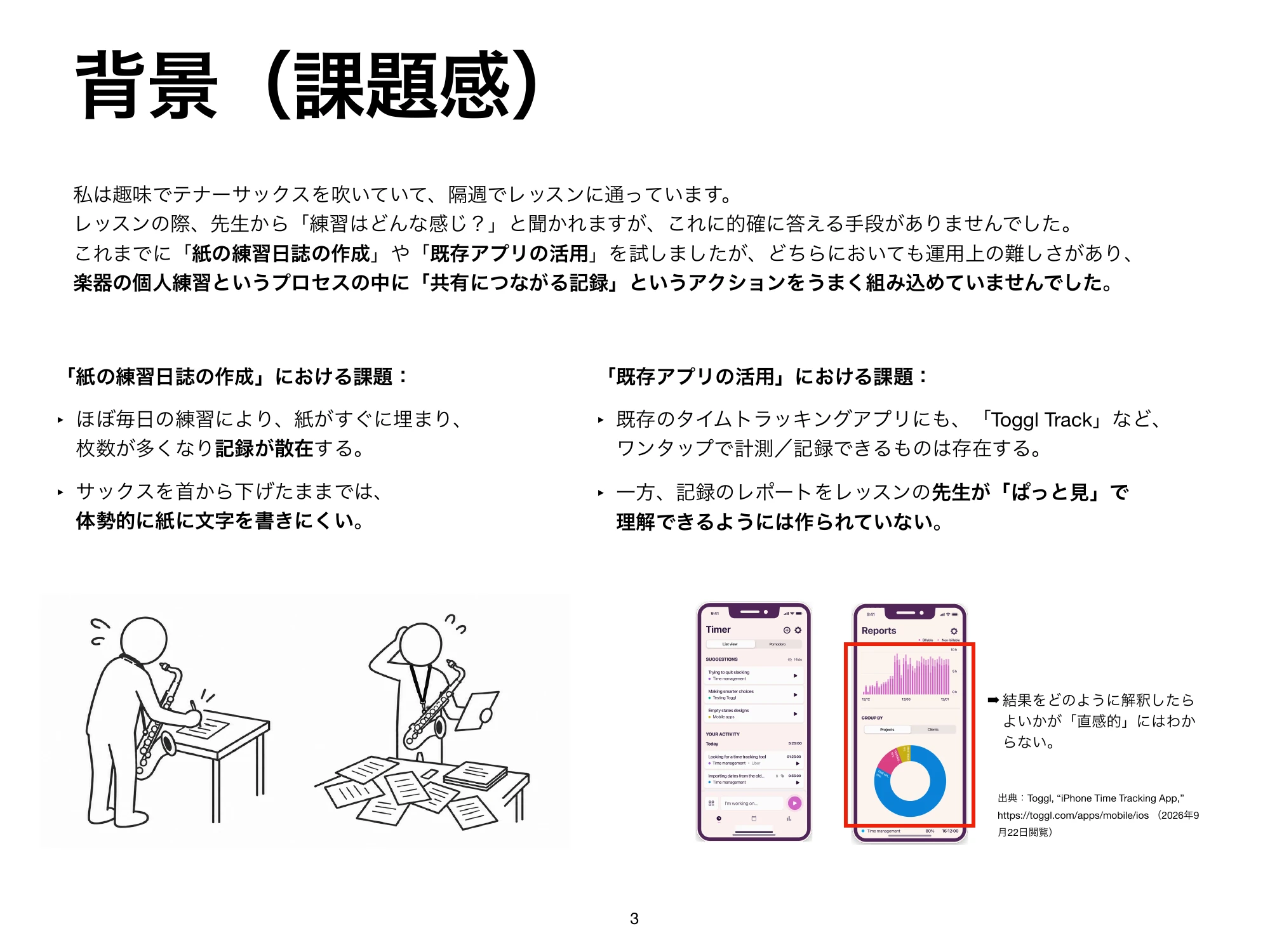
At my fortnightly lessons, saying “mostly scales” didn't convey what I had practiced or for how long. A paper journal was awkward to write in with a saxophone hanging from my neck, and the time-tracking apps I tried were tools for reviewing my records on my own.

Bars for practice days and gaps for days off appear between two lesson dates. Combining each day's time by category into a single bar below gives a total of 10 hours 06 minutes.
The upper bars show daily practice; red outlines mark lesson dates. At a lesson, I show a summary of the practice in between. Dates and times are fictional examples; the upper and lower bars total the same duration.

Logging — With an instrument in hand, just one tap

During practice, I only touch the category cards. Tap to start timing, tap another card to switch, and tap the same card again to stop.

Log screen. A practice history grid sits above today's bar (54 minutes in total) and category cards. “Piece practice” is being timed at over 27 minutes, highlighted with a brighter color and a white outline.
1 History
Practice so far. The first thing you see on opening the app.
2 Today
The order and balance of practice. Full at one hour.
3 Timing
Only this card is bright, with a white outline.
4 Cards
Tap to switch. Today's time is prominent.

One day — Once the bar is full, it stays full

Today's bar fills up at one hour. Beyond that, the current total becomes the right edge, so empty space never reappears in a bar that was already full.

Today's practice — 1 h 05 min

Chosen

Discarded

A comparison at 65 minutes of practice. Above is the chosen design: the total sets the right edge, with a minimum scale of one hour. Below is the discarded design, which expands the scale from 60 to 90 to 120 minutes. As soon as practice exceeds one hour, empty space returns only in the lower bar.

Accumulation — Everything, back to the first day

Shades of green show practice days, red outlines mark lessons, and horizontal scrolling reaches back to the first recorded day. I prioritized seeing years of practice over keeping rendering lightweight.

Practice history grid. Shades of green show practice volume from June to September, with red outlines around fortnightly lesson dates.
Five levels: 0 minutes, under 30, under 60, under 90, and 90 or more. This accumulated practice is the first thing you see when opening the app.

Sharing — At the start of a lesson, one screen tells the story

Totals by category and a daily breakdown summarize the period from the last lesson to today, ready to show the teacher. The daily table fits every category on one screen, even at the cost of smaller text, eliminating horizontal scrolling.
Evolution — Turning cards into a control panel for practice

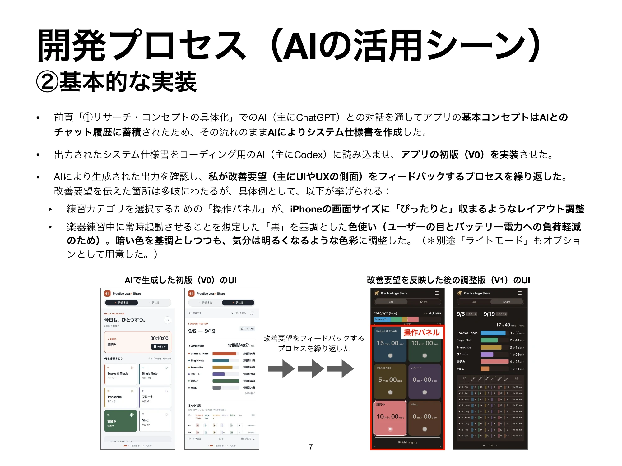
I built the screens from a specification developed through dialogue with AI, then repeatedly tried and revised them myself. I explored how logging and sharing should work in an early web version before implementing an app for iPhone.
Initial version on September 9. Six small category cards and today's total of 40 minutes occupy separate areas of the Log screen.

September 9
Initial version

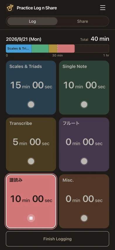
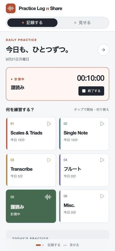
Web version on September 21. Categories and today's time share large cards; the active 10-minute score-reading session is highlighted.

September 21
Web version

Log screen. A practice history grid sits above today's bar (54 minutes in total) and category cards. “Piece practice” is being timed at over 27 minutes, highlighted with a brighter color and a white outline.

September 24
iOS 1.0

The initial and web versions use the same fictional data (six categories, 40 minutes today). iOS 1.0 uses different fictional data.
Name and time, together
I made today's time prominent on each card, linking what I practiced with how long I spent on it.
The current state, at a glance
I brightened only the card being timed and dimmed the others.
Controls within the screen
I made scrolling stop where a row of cards fits within the screen.

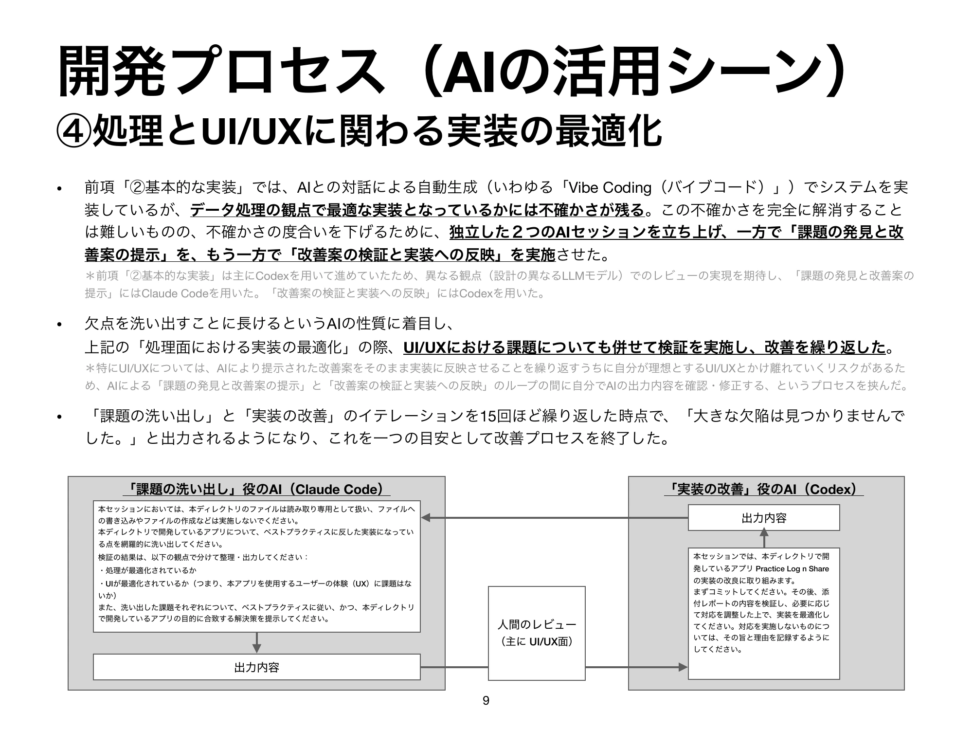
Toward the end, I repeated a cycle about 15 times: Claude Code identified potential issues, Codex checked and fixed them, and I decided which changes to accept.

Feel — Choosing how scrolling stops by trying it

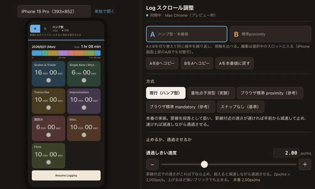
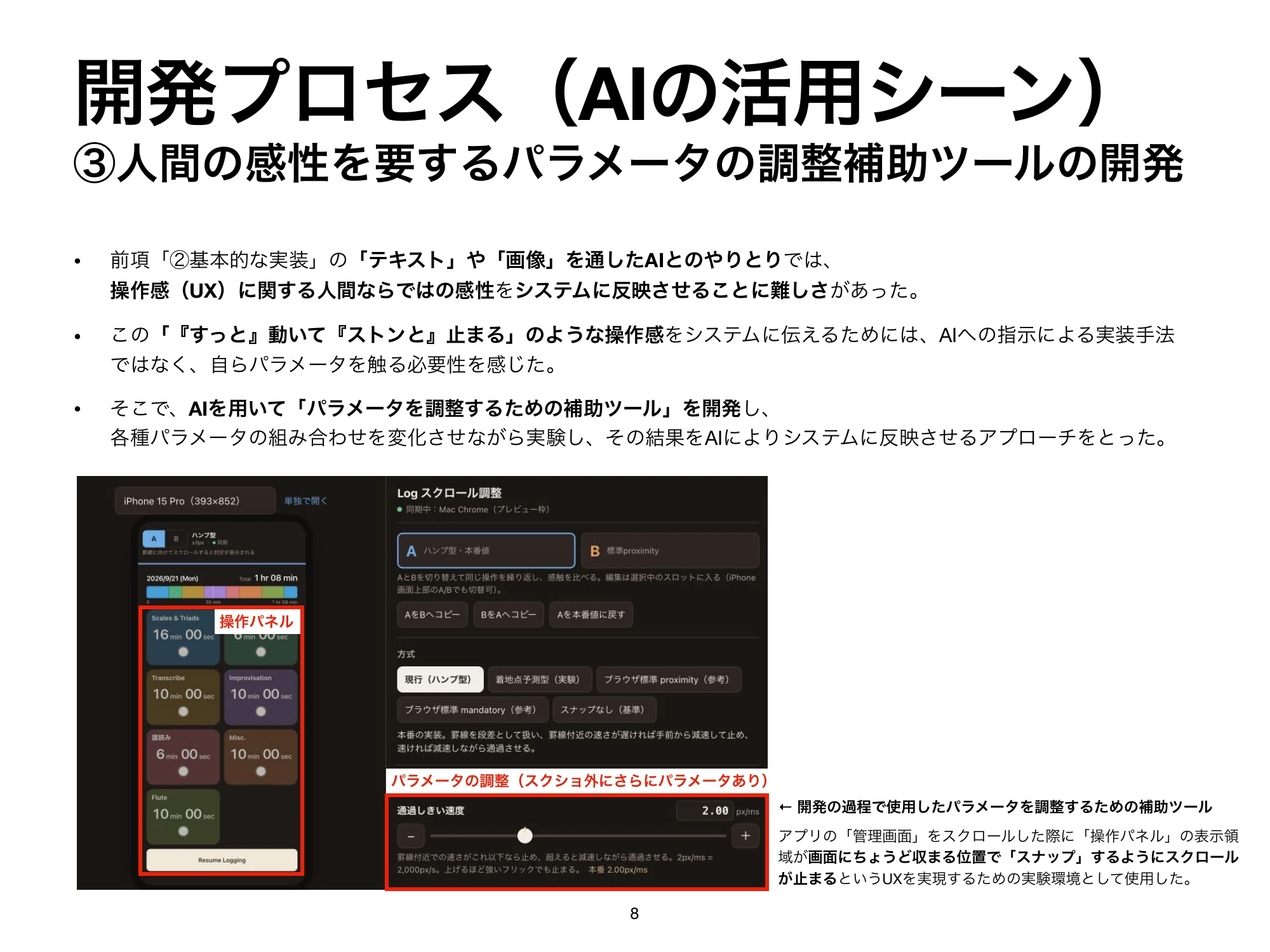
I couldn't achieve a feeling of “moving smoothly and settling neatly” through verbal instructions alone. I built a tuning tool with AI to switch methods and values on the spot, tried five methods on a real device, and chose the browser's native snapping.

Hump model
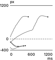
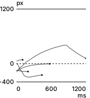
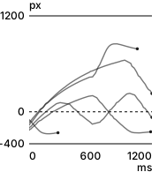
Five real-device gestures using Hump model. The horizontal axis is 0–1200 milliseconds after finger release; the vertical axis is distance from the snap position. The dotted zero line marks the snap position; the dot at each line's end is the last measured position.

Projected landing

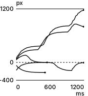
Five real-device gestures using Projected landing. The horizontal axis is 0–1200 milliseconds after finger release; the vertical axis is distance from the snap position. The dotted zero line marks the snap position; the dot at each line's end is the last measured position.

Native proximity
Chosen

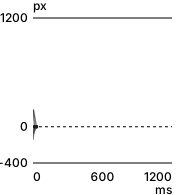
Five real-device gestures using Native proximity. The horizontal axis is 0–1200 milliseconds after finger release; the vertical axis is distance from the snap position. The dotted zero line marks the snap position; the dot at each line's end is the last measured position.

Native mandatory

Five real-device gestures using Native mandatory. The horizontal axis is 0–1200 milliseconds after finger release; the vertical axis is distance from the snap position. The dotted zero line marks the snap position; the dot at each line's end is the last measured position.

No snapping

Five real-device gestures using No snapping. The horizontal axis is 0–1200 milliseconds after finger release; the vertical axis is distance from the snap position. The dotted zero line marks the snap position; the dot at each line's end is the last measured position.
Positions after finger release, compared at the same scale. The dotted zero line marks the snap position. From device logs, I selected five gestures per method with speeds of 0.6–1.8 px/ms, calculated from positions in the preceding 60 ms, choosing those closest to 1.2 px/ms. Settings, starting positions, and directions differ between gestures.
Scroll tuning tool. Controls for switching among five snapping methods and their parameters sit beside a phone screen for trying the interaction.
I compared how scrolling stopped on a real device while recording distance and speed. Open the image to enlarge it.

As a product — Beyond practice

The appearance follows the device's settings. Practice records are stored on the device and backed up automatically to iCloud.
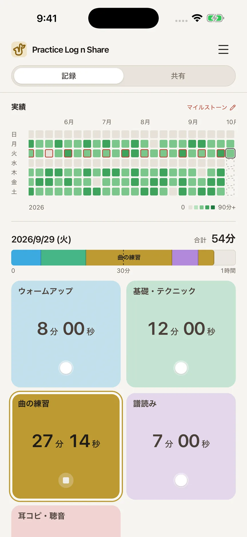
Light mode. Log screen. A practice history grid sits above today's bar (54 minutes in total) and category cards. “Piece practice” is being timed at over 27 minutes, highlighted with a brighter color and a white outline.Dark mode. Log screen. A practice history grid sits above today's bar (54 minutes in total) and category cards. “Piece practice” is being timed at over 27 minutes, highlighted with a brighter color and a white outline.
The same Log screen in light and dark modes.
109 theme icons to match what you practice, arranged as musical instruments, exercise, learning, painting, crafts, and expressive activities.
Choose an icon for the app header to match what you practice: 47 for music, 15 for exercise, 15 for languages and learning, 11 for art, 14 for making and everyday life, and 7 for expression. The saxophone is based on Qlementine Icons (MIT License).

In use — The next question: how much detail to record

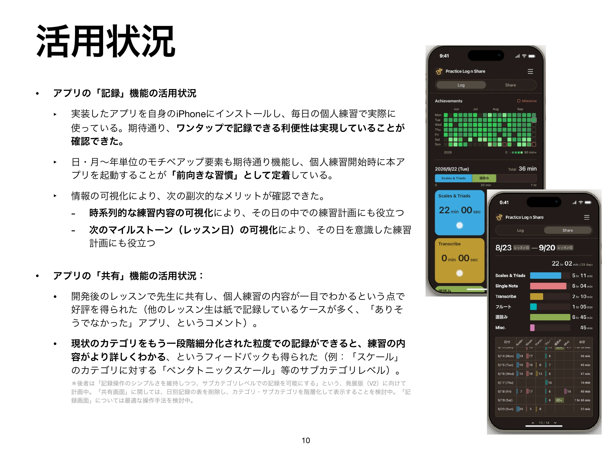
I used the app for my morning practice and showed the screen to my teacher at a lesson. The feedback was that the content of my practice was clear at a glance, and that recording the types of scales would make it more useful (paraphrased). I'm considering a level below categories to capture more detail while keeping logging simple.

Materials

The web demo lets you try logging and sharing. It includes my own practice records as of September 20, 2026; any changes you make are saved only in the browser you're using.
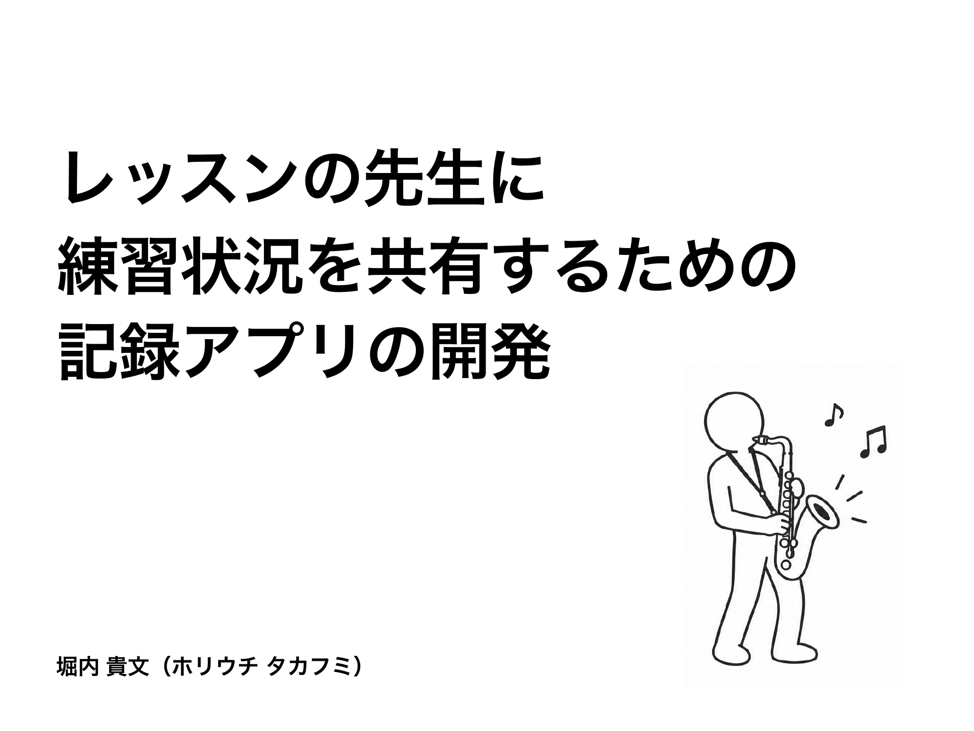
  1. Slide 1. Cover: Developing an app to log practice and share it with a lesson teacher. Takafumi Horiuchi.
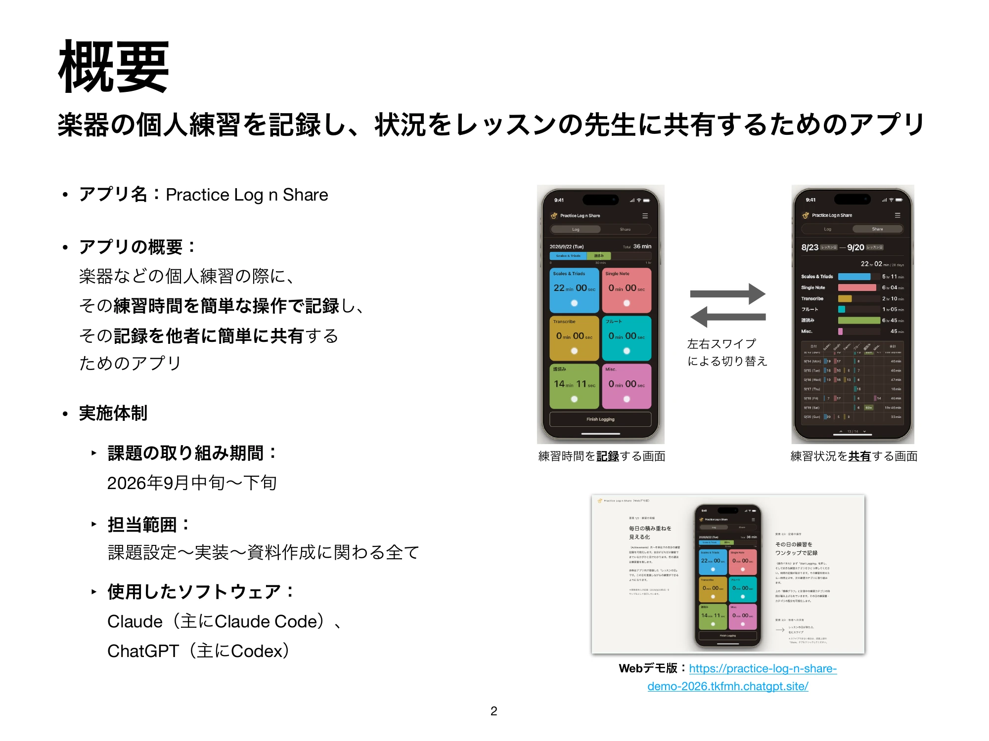
  2. Slide 2. Overview: Log for recording practice and Share for showing it to the teacher. Role, project period, and tools.
  3. Slide 3. Background: A wish to communicate saxophone practice accurately to the teacher. Problems with a paper journal and existing apps.
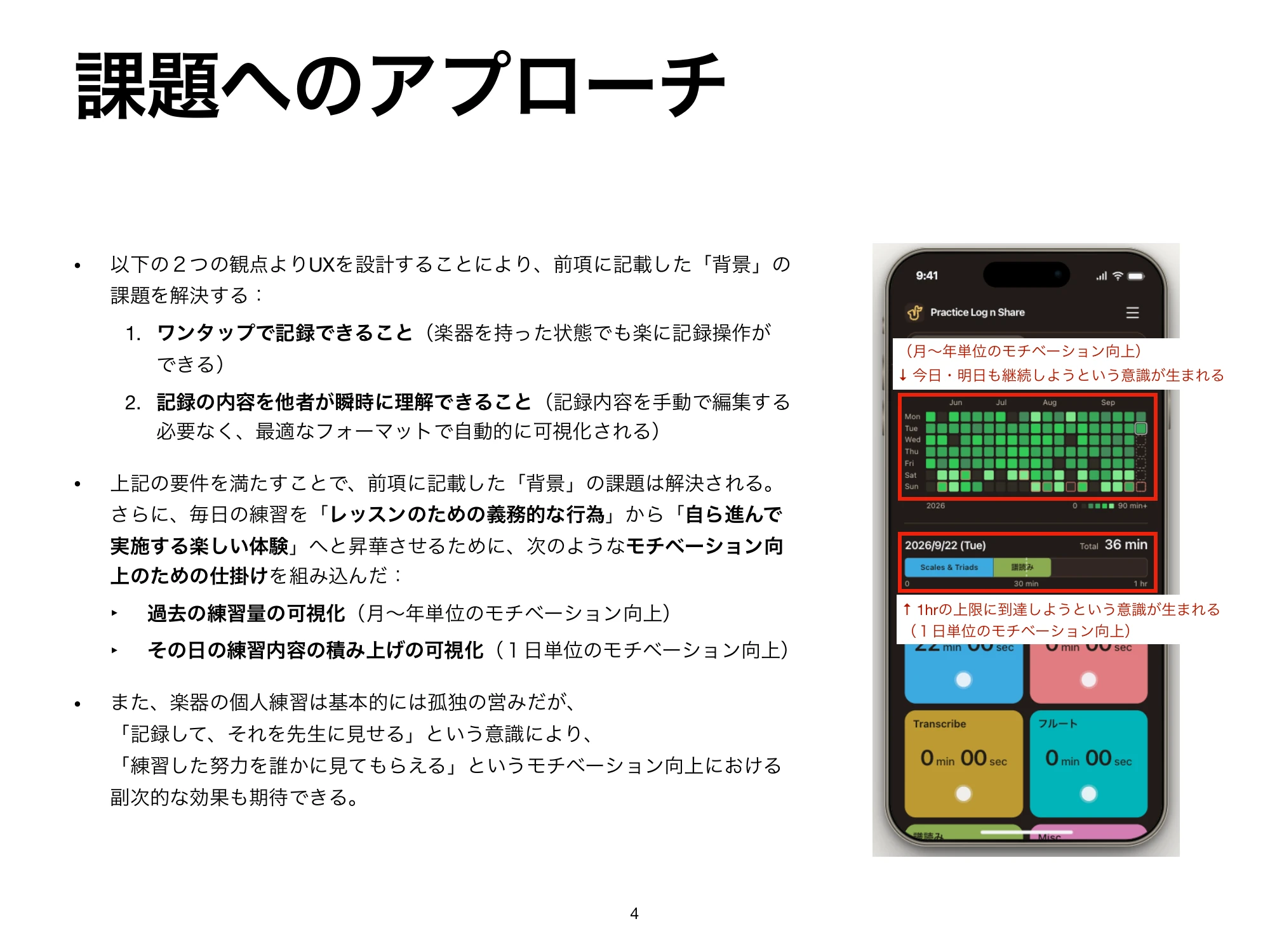
  4. Slide 4. Approach: One-tap logging and visualization that communicates instantly. Showing accumulated practice at two scales: a day, and months or years.
  5. Slide 5. Four uses of AI: research, initial implementation, a tool for tuning interaction, and implementation optimization.
  6. Slide 6. Collaborating with AI: researching existing apps and refining the concept through dialogue.
  7. Slide 7. Initial implementation: comparing AI-generated V0 with V1, revised through repeated feedback on layout and color.
  8. Slide 8. Tuning interaction: building a tool with AI to compare scrolling speeds and stopping behavior myself.
  9. Slide 9. Implementation optimization: repeated issue suggestions from Claude Code and checks and fixes by Codex, with human decisions.
  10. Slide 10. Results and next steps: use in my own practice, feedback from my teacher, and consideration of subcategories for more detailed records.
Scroll horizontally through the slides. Click or tap to enlarge. Original slides are in Japanese.

Open the project materials as a PDF (Japanese, 4.4 MB)